


Lorena
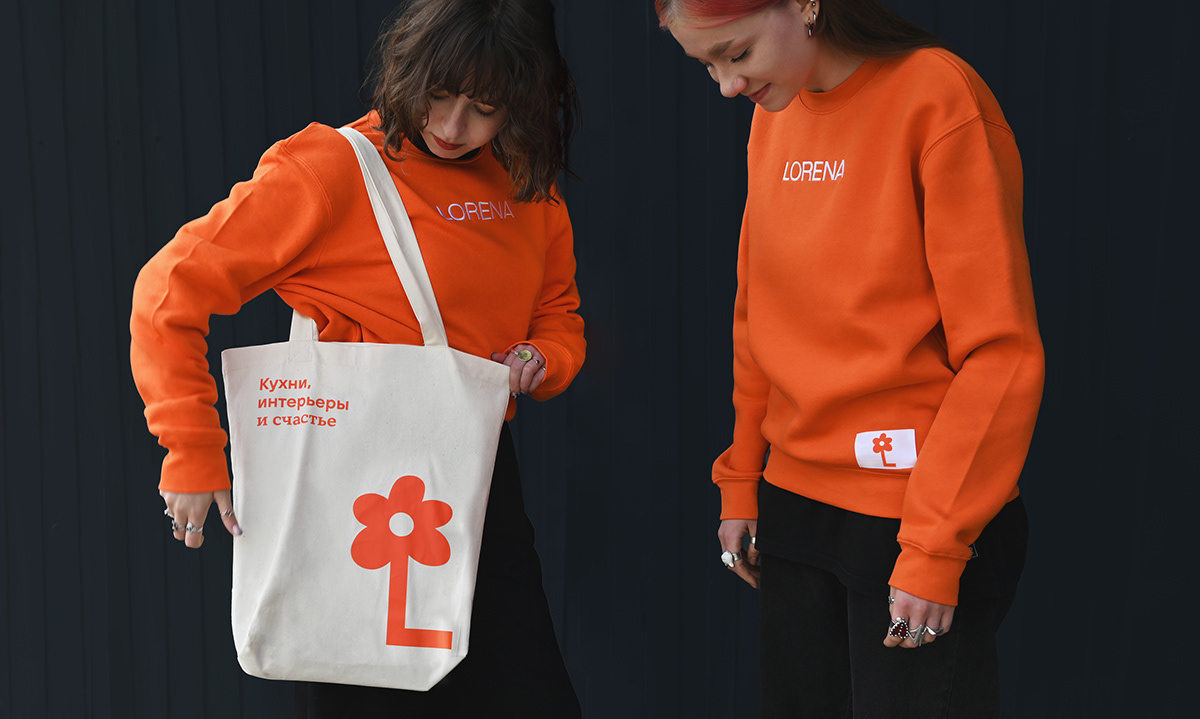
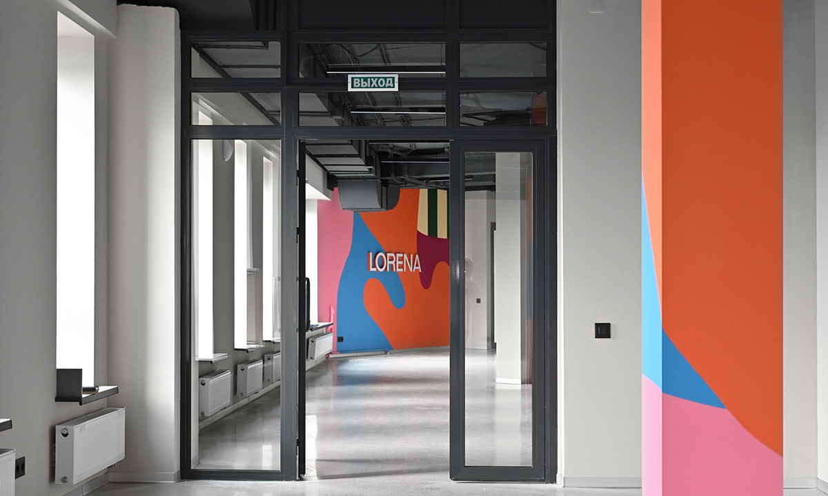
Rebranding of a large furniture and interior factory. Floristry and light Scandinavian vibe illustrate the central idea of the factory, where family happiness comes as a gift for purchase. And this happiness is first reflected in an ironic monogram flower, and then in a bright corporate pattern. Abstract and vivid home patterns and images are used to support a slightly naive symbol, which as it is becomes a sea of emotions, which is happiness.
The brand's slogan was "Family happiness as a gift." And what is "happiness", and what does it look like? An unexpected and slightly naive image of happiness is going to form a light and slightly ironic monogram-flower. Happiness is a sea of emotions. A simple and clean message has become the basis for a bright and abstract pattern, which is actively used on large surfaces. And at the same time, he bluntly declares that a solid interior brand does not have to be boring. Concise but vivid illustrations support the corporate pattern.
Made in Suprematika
Vladimir Lifanov, Creative Director
Vuda Villadia, designer
Vyacheslav Nazarenko, animator
Sergey Lyakhovich, account
Vladimir Lifanov, Creative Director
Vuda Villadia, designer
Vyacheslav Nazarenko, animator
Sergey Lyakhovich, account


